We measure the success of a business by the number of customers it has. But this isn’t always as easy as it sounds. In the digital age, customers are everywhere, and they’re willing to shop from any device they can get online. This means you have to reach out to them, or risk being left behind.
In the past couple of years, Google has been putting more and more emphasis on mobile SEO. The search engine prioritises websites with fast load times, so if your site is slow, to begin with, chances are it will be a less appealing candidate for ranking high in a mobile SERP.
Slow-loading sites also tend not to do very well in terms of user experience – impatient visitors bounce right off – so even if your site does rank, you still run the risk of losing users.
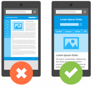
A correctly set up website for mobile devices can be easy to view and navigate on any screen size. It should also have a clear, functional layout with elements sized appropriately for tiny fingers (or even just standard mouse pointers). Three areas primarily need attention to bring your website up to speed:
- Proper optimisation
- User experience
- Social media integration
Mobile SEO factors include all the criteria used by Google to determine where websites fall within search results. When you’re starting out with mobile SEO, it’s essential not only to address these factors but recognise them as well. Especially if you are older or are otherwise unfamiliar with smartphones or tablets, it can be easy to think that mobile SEO is not something you need to bother with. Still, there are many good reasons why it absolutely should be addressed.
What is mobile SEO?
Search engine optimisation (SEO) has always been an essential step in reaching out to your customers and determining your website’s placement in search results. When it comes to mobile optimisation, however, there are some things that Google looks for that might differ from what they use on their desktop algorithm.
To give yourself an edge over the competition, you must ensure that your website is optimised for ordinary web crawlers and smartphone users alike.
What is the Mobile-First Index update by Google?
“As we noted earlier this year, today’s the day we begin globally rolling out our mobile-friendly update. We’re boosting the ranking of mobile-friendly pages on mobile search results. Now searchers can more easily find high-quality and relevant results where text is readable without tapping or zooming, tap targets are spaced appropriately, and the page avoids unplayable content or horizontal scrolling.”—Google, 2015.
Google’s mobile-first indexing has been in the works since 2016. The search engine giant announced that they would start indexing sites based on their mobile version beginning in 2019. It meant the process of crawling the pages and giving ranking priority to all pages within a website is now done according to its mobile version.
What does this mean for you? Sites already doing Optimisation for SEO would not experience massive changes or losses due to their efforts. However, this change will affect users because there might be times when visitors using phones cannot see your blog posts or product pages if it is not optimised for mobile devices.
It implies that the way your site appears when viewed through a smartphone should be the same as its desktop version. Otherwise, this may affect your search ranking and traffic in the long run.
Google recommends that you make sure your site is responsive to different mobile devices by using a tool like Google Mobile-Friendly Test or double-check the rest of the pages using a crawler such as Googlebot for Smartphones. After which, you can edit these files from your CMS platform or HTML code manually.
In most cases, there would be only minimal changes made to URLs when migrating from regular desktop URLs to mobile URLs. It takes only a few hours before you will be able to reap all the benefits of mobile-first indexing.
But if it so happens that HTTP://yoursite/blog/post-title will no longer work as a mobile URL, you should make sure that your new mobile URL is http://www.yoursite.com/blog/post-title.
What is Google’s Mobilegeddon update?
The name comes from the word Armageddon, which means “a decisive battle or confrontation”. So, if your website isn’t mobile-friendly, it might not rank as high as it used to, and you could see a drop in traffic.
As we already mentioned, Google introduced its Mobile-friendly ranking algorithm back in 2015. The idea behind this change was simple: Google wanted their users to get the best possible experience while searching on their platform. It meant they needed to improve the visibility of mobile-friendly websites and decrease that of non-mobile friendly ones.
In short, the Mobilegeddon algorithm ensures that when a mobile user is searching the net for ‘the best used cars in Denmark’ that the results on the mobile search page will deliver the most mobile friendly sites at the top to further enhance the mobile user’s experience on Google.
Keep in mind:
- It only affects search rankings on mobile devices
- It is applicable to all search results in all languages globally
- It applies to each page on your site individually, not entire websites
As part of its ” Mobilegeddon” update, Google determines whether web pages have enough relevant keyword content to match the user intent while considering different factors such as device type, location, language preference, etc. The more optimised your website gets for mobile devices, there is no doubt that this would result in a higher click-through rate (CTR) which could also help improve organic traffic.
How is this different from AMP?
Accelerated Mobile Page (AMP) is an open-source initiative supported by Google to increase user happiness, publisher revenues and page speed. It can quickly create lightweight versions of your pages that load instantly when viewed from a desktop or wireless device. It would be best if you did not totally abandon traditional HTML. Still, it would surely help if you consider using this tool whenever necessary, such as when creating forms, photo galleries, maps and many more.
Google’s Accelerated Mobile Pages (AMP) focuses more on serving pages that load quickly and seamlessly for mobile devices. The search engine giant also encourages web admins to entirely focus their attention on making sites responsive and easily viewed both through desktops and wireless devices. It aims to prioritise all the content of your site regardless of device compatibility. It means there is no need for using separate URLs than what was previously needed, such as http://yoursite/blog or http://www.yoursite.com/blog.
What counts as Mobile-friendly and what doesn’t?
To determine whether a website is mobile-friendly or not, Google uses a list of criteria that you can find on its official page. It includes:
- Size of the text
- Legibility of the content without zooming
- Sufficient spacing between links
- Large enough tap targets (They should work regardless of finger size)
- The site’s load speed
- Visible URL address bar
Is this really such a big deal?
If you’ve been following SEO news over the last few years, you might already know why the Mobilegeddon update is such a big deal. If not, you’re in for a treat!
According to findings published by ComScore, more than 60 percent of users click into Google’s first-page result while only 2% go past page two. It means that if you don’t optimise your site for mobile devices, users might not be able to access it at all.
TIP: How do we know we will get better results? To test whether or not your website has been affected by this update, go to Google and type the following: “mobile-friendly test.”
How to check each page?
To index all contents of your site, you should also make sure that there are no broken links or pages that do not appear in any way when a user searches for something on their devices. You can check this by using various Webmaster tools provided by Google, including Mobile-Friendly Test and Fetch as Google. The latter would let you see all the URLs found on your site while previewing how it will look through mobile devices. There is also an option to submit individual URLs for indexing through Fetch as Google instead of bulk submission, which could be automated if necessary.
In some instances, Google has already indexed your desktop version before you successfully launch its mobile version. In such a case, the only option left for you is to wait and watch as the search engine giant discovers all pages found on your site. There is also a chance that Google would stop ranking your desktop version if it detects that the mobile version has more information or content than its desktop counterpart.
How to make a website mobile-friendly?

An effective Mobile SEO strategy includes:
- Improving your site’s load time according to the latest Core Web Vitals update.
- Integrating a responsive web design.
- Dynamic Serving setup where the server responds with different HTML (and CSS) on the same URL depending on which user agent requests the page (mobile, tablet, or desktop). It serves different code to each device, but on the same URL.
- Separate URLs (option).
- Optimize for Local Search.
- Optimize for Voice Search.
- Structured data.
- Use Google’s Mobile Usability test to understand the current mobile situation.
- Manually editing your code or using a CMS plug-in explicitly designed for this purpose. After choosing one of these options, you might have to test your site’s performance and optimise it as needed. However, there’s a chance the original version was already mobile-friendly, so you don’t need to do anything.
Mobile SEO step-by-step
- The first thing you’ll want to do is eliminate any “fat” or unnecessary code within your HTML files. Using too many plug-ins, widgets, or other features can slow your site down, which is bad news for both desktop and mobile users.
- Improve web design – do not go overboard with animated images. Use responsive design tools or those that stretch to fit the width of your screen so as not to frustrate users who would rather have a hassle-free experience.
- While it’s not always feasible to cut out every bit of fluff that makes up your site design, cutting back where possible will help speed up your page load time and improve overall performance. Avoiding Flash files is also crucial, as they are known to cause issues with mobile devices. Make sure to optimise any images you use for viewing on smaller screens by reducing their file size without compromising quality, if possible. If you have videos included on your website, try to host them off-site instead of embedding them directly into the HTML files (make sure you include a hyperlink).
- Incorporate location tagging and other metadata – if you are into local business, make sure that Google could easily find your company’s website by simply inputting a few keywords such as ” pizza parlour near me”. Thus, you should utilise these features together with the use of schema markup. Newer search engine algorithms include structured data, allowing them to determine whether particular content in a page can help improve its organic ranking. Apart from schema markup, you may also consider using updates such as JSON-LD, Microdata and RDFa.
- Protect your online reputation – avoid publishing any web page that contains offensive content such as pornographic photos or articles. It could affect your site’s ranking by triggering spam reports from users who come across malicious sites often associated with phishing scams.
- Online user experience determines your success, as such the mobile version of your website should be focused on precisely that. Ensure all links work correctly, and take some time to double-check anything you’ve got embedded within an iframe (widgets like map tools can sometimes be troublesome unless they’re hosted on sites like Google Maps).
- A mobile user is undoubtedly in a hurry – he likely won’t wait more than 5 seconds for your page to load before heading somewhere else; making sure everything shows up quickly will improve the turnout.
- One of the most effective ways to communicate with customers is via Social Media. Still, it’s also one of the easiest targets for SEO hackers who want their content promoted over yours. If you have any integration with Facebook, Twitter, or other sharing services, make sure you set everything up properly so that only quality information is being shared.
- Keep in mind that these sites link back to your content and give it credibility through the user accounts of friends – getting listed on sites like Digg or Reddit can also help boost search rankings. The more people who see and enjoy your website, the higher their chances of hitting the first page of results.
Mobile SEO doesn’t have to be difficult if you take some time upfront to do it right. Quality over quantity is definitely the way to go when designing for smaller screens, so use that as your guide and get started with optimising today.
Benefits of mobile SEO
Many local businesses are choosing mobile optimisation for their websites over desktop optimisation. It is because mobile searches have surpassed desktop searches, representing 60% of all online activity. If you own a small business in the city of Cracow, it’s essential to have your website optimised for mobile devices so customers can find you on Google Maps.
There are many reasons why you should consider making your website mobile-friendly. For one, Google has found that websites correctly optimised for smartphones tend to have higher CTRs (Click Through Rate), improved time-on-page metrics, and lower bounce rates.
It means more users are staying on your site longer, which is excellent news. Another advantage is that having an SEO strategy in place will help improve the way search engines rank your business online. We’ve said it once, and we’ll say it again: If you want your business to be competitive, you should work towards becoming an industry leader.
That being said, there are still other benefits to making your site mobile-friendly, which include the following:
- Improved customer satisfaction
- Higher perceived usability
- Better conversion rates
- More efficient communication
What search engines think of your site – Core Web Vitals update
Google’s recent Core Web Vitals update factors in its rankings how fast a given page loads no matter what device it’s viewed on. A site that takes longer than four seconds to load will result in lower rankings if users don’t stick around or bounce away due to slow load times or issues with accessibility on certain browsers or devices.
Local directories such as Google maps are now starting to prioritise companies that have optimised their sites for mobile devices, along with Yelp. So if you don’t have a site ready for mobile devices, it’s time to get one created.
Make the call
We trust that you have more insight into the absolute necessity of optimising your website for mobile users. The numbers will only increase as smartphones become a fixed extension of our lives, not merely one of the tools we use to communicate, buy, and sell.
Our SEO team is excited to help you along the path to increased online success. Contact us, and one of our senior team members will be happy to discuss mobile optimisation with you.

Head of SEO
Kyle works as a Head of SEO at MediaGroup. Based in Scotland, he has extensive experience in SEO and digital marketing on both the client and agency side, having held key roles in advertising, B2B and other companies. Kyle's deep knowledge of SEO, web development, content marketing and data analytics is invaluable in managing complex strategies for our enterprise clients.
Popular categories:
The Memorable Marketing by MediaGroup podcast series interviews leading senior marketers worldwide on all things marketing, campaigns, strategy, building awareness and everything that makes a brand successful.
Join the conversation by leaving your thoughts and questions, and we will be happy to chat with you. If you want to discuss your business marketing strategies in more detail or join our podcast as a guest, please reach out to us at: [email protected]
Latest Insights

Article
Facebook Ad Creatives: Best Practices to Make Your Ads stand out
Attention is one of the most valuable things a consumer or social media user can give your business. It’s also the prerequisite for getting followers, generating awareness, and making a sale.
Written by Eva Lasova
Quarterly marketing insights in our newsletter
We are committed to helping you get the best results in your digital marketing game. Our experts will give you actionable insights and knowledge, based on our experience, to tackle the biggest marketing challenges. Unsubscribe at any time.
Mediagroup Worldwide processes the above information in order to subscribe you to the newsletter. Privacy Policy